

Logo Concept Presentation
Logo directions created for Clearfield Consulting Co
Review the two refined logo directions below. Each direction is shown in two color palettes so you can evaluate the logo structure and color separately before selecting your preferred combination.
01
Presentation Overview
Exploring a clear and confident visual direction
Both options position Clearfield Consulting Co as credible, organized, and approachable, but they express those qualities in different ways. Option 1 uses a bold circular monogram, while Option 2 uses a lighter framed monogram. Each direction is shown in Navy + Sage and Burgundy + Gold so the logo design and color palette can be evaluated independently.
Choose the logo structure that feels strongest first, then identify the color palette that best matches the brand personality. After those selections are made, feedback will guide final refinements to spacing, typography, color balance, and supporting logo variations.
02
Logo Drafts
Compare two logo directions in two color palettes
Each logo direction appears in both proposed palettes. Select the direction you prefer, then choose your preferred color palette in the feedback form.
Creative Direction 01
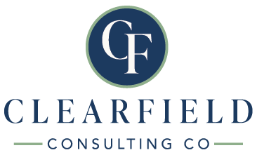
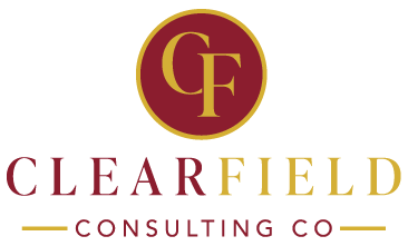
Circular CF Monogram
This direction centers the initials inside a bold circular emblem, creating a compact and recognizable brand mark. The traditional serif lettering feels established and professional, while the rounded enclosure makes the identity feel cohesive, confident, and easy to use across digital, print, and social applications.
Creative Direction 02
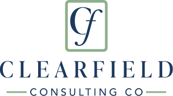
Framed CF Monogram
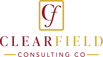
This direction uses a lighter, more open monogram inside a rounded rectangular frame. The flowing lowercase-style “f” adds personality and movement, while the structured border communicates clarity and organization. It feels refined and approachable with a more distinctive, boutique consulting presence.
03
Review Guidance
How to evaluate the concepts
Focus on the overall direction rather than small details. Color, spacing, type adjustments, and minor refinements can be addressed after a concept is selected.
Brand Alignment
Which option best reflects the mission, values, personality, and audience of the business?
First Impression
Which concept creates the strongest feeling of trust, clarity, and professional capability?
Long-Term Fit
Which direction feels flexible enough to support the business as its services and visibility grow?
Useful Feedback
Share what works, what feels less aligned, and specific details you would like refined.
04
Client Feedback
Select your preferred direction and share your thoughts
Your responses will be sent directly to KJ Graphix. Please consolidate your feedback into one submission whenever possible so the revision process remains clear and efficient.
“I prefer Option 2 because the framed monogram feels approachable and distinctive. I would like to move forward with the Navy + Sage palette and slightly refine the spacing around the initials.”
Feedback Received
Thank you for reviewing your logo concepts.
Your selection and feedback have been sent to KJ Graphix. Please keep an eye on your email for revision updates and next steps.